
Mobile Friendly vs. Responsive Web Design
What is the Difference?
Mobile Friendly Design – What is This?
 When designing or redesigning a website, you must consider creating an alternative, condensed, mobile-friendly version of the site or a complete resposive layout (see below). These versions are not to be confused with native applications that live on your smart phones (the ones you download from app stores).
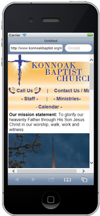
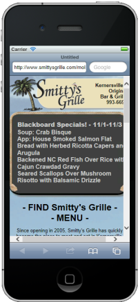
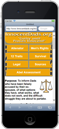
Smart phones all have web browsers and can render your website with varying degrees of success. Essentially, you must make a list of what devices you will support, and design alternative sites to meet these multiple targets. Other than that, the most obvious constraint they all share is the small screen size of phone browser windows.
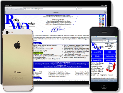
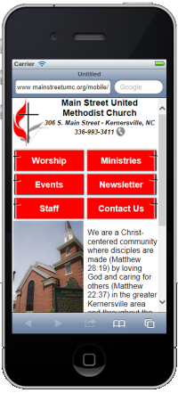
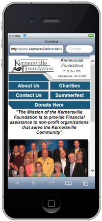
As of April 2015, 100% of Rich’s Web Design clients are now MOBILE FRIENDLY! This is a significant achievement, as I have been working towards this for more than a full year.

Responsive Web Design – What is This?
Responsive Web Design is simply designing your site, changing your site so that it renders properly on all devices. Wiki defines it as:
Responsive web design (RWD) is a web design approach aimed at crafting sites to provide an optimal viewing experience—easy reading and navigation with a minimum of resizing, panning, and scrolling – across a wide range of devices (from desktop computer monitors to mobile phones)….
Your customers are visiting your Web and mobile sites on a multitude of devices. Does your web and mobile site work properly across all these devices? Do you know how your site appears in the major MOBILE platforms / browsers? How about Google Android? – Apple iOS / iPhone? – IPAD? – Blackberry? – Depending on the layout and size of graphics, your site may look perfect on your PC, laptop, but not sized properly for any of the above MOBILE devices.
*** Check your Google Analytics Reports that are sent to you every month. See how many people are viewing your site w/ a mobile device? Take a look at your own site on your mobile phone as well as other people’s smart phones.
Google Latest Tool Named ‘Resizer’
Simply go to this URL – http://design.google.com/resizer/ and enter your own URL to see your site and how it renders on a desktop, tablet and mobile device…. or simply enter your URL below, then enter.


5 (… many more! … ) Reasons for Mobile Designs – from http://www.webaloo.com/why_mobile.aspx
The mobile web is a fascinating space that is still in its infancy. If the current capabilities of mobile devices are a sign of things to come, I can only imagine what will be possible five years from now.
Here are 5 reasons I think that anyone with an online presence should establish a mobile presence separate from your website:
1. Google has a separate index for mobile content.
Not only do they have a separate index for mobile content, but also it is fairly empty. …
2. Your regular website is not going to cut it.
There is a fundamental design difference between a regular website and a mobile website. On a mobile phone, there is a very limited amount of screen space….
3. 1/5 of Americans access the mobile web each day.
This percentage is increasing every year. If you’re not representing yourself on the mobile web, your competition surely will take up the opportunity.
4. Mobile web will overtake the desktop within 5 years.
Not only will the mobile web inevitably overtake the desktop, but also usage and adoption is growing at a much faster rate than the desktop did. In the future, the vast majority of visitors to your website will be on a mobile device.
5. $1.6 billion purchased from mobile devices in 2009.
This is likely the most exciting and sought after information about the mobile web. If millions of people are using the mobile web, but they are not buying anything, most commercial websites would not bother establishing a mobile presence…. You can rest assure that the same thing will happen with the mobile web.
MORE REASONS …
5. Outsmart your competition – Convert your website for mobile devices and you will obtain a higher position in Google, will be accessible to more readers and you’ll step ahead your competition.
6. Increase your daily traffic with up to 20% – The reports show that those who have converted their website into a mobile one noticed an increase of their traffic with 20%.
7. 93% of U.S. adults own a cell phone.
Not all cell phones have Internet access capabilities, but that is currently the trend. Smart phones are not the only ones with access to the web….
8. 5% of the top 500 online retailers have a mobile website/iPhone app. – I was rather surprised by how low this number is. But then again, this means great things for the rest of us who are not in the top 500 online retailers. I am willing to bet that one of the biggest reasons that you’re not ranking as high as you would like is because your competitors are doing a better job than you are in some shape or form. Which means that if you’re reading this, chances are fairly high that you are already a step ahead of your competition.
9. Reach the Top of the Results: Google lists mobile websites separately for searchers, and relatively few websites are listed on their results at this time. Using the right keywords and geographical targeting on your website could give you the first result for related searches.
10. Better Results: A few experimental browsers attempt to load normal websites without mobile compatibility, but they display them with missing images and distorted text. A dedicated mobile website ensures that all visitors access the same information and features no matter what device they are using.
11. Mobile is Search – Mobile search is one of the fastest growing online resources. Google®, Bing® and Yahoo!® are heavily investing in mobile – they know that millions of people use mobile search to look for what they want. The best way for your business to be found, is to be listed in top search engines AND have a fully optimized site that is user friendly.
12. Mobile is Local – Not getting enough local attention for your business? Mobile marketing can help you by engaging local search -maps and directories that make it easy to find your front door. Tools like Google® Maps and local directories provide general information that include your location, contact and address. Enhance these tools with a mobile website that can turn traffic into customers by including easy-to-access information such as ‘About Us’, ‘Find Us’, ‘Hours of Operation’, ‘Coupons ‘and ‘Reservations.’ If your goal is to turn a local lead into a local sale – a mobile site may be just what you need.
13. Mobile users expect a simplified (and a quick loading) browsing experience – While modern smart phones can render full websites (with the exception of Flash for iPhones), mobile users expect a site that loads quickly, is easily navigable (without pinch-zooming) and contains plenty of functions and sections that are pertinent to mobile users.
14. Visitors are using mobile devices to plan trips as well as using them at their destination – Users are planning their trips using mobile devices and they’re definitely using them when they’re at your location.
15. Google will penalize you: Google has recently made it very clear that a bad mobile website or even websites that aren’t optimized for mobile will lose significantly in terms of search ranking. As more and more people use mobile devices for search, Google is streamlining its process to serve them better.
16. Google wants it – The leading search engine has been making a push toward more mobile websites because it believes this is what smartphone users want. Google wants to continue to look good to those using its search capabilities. Websites designed for a personal computer do not look good on a smartphone.
17. Your customers are on mobile even when they are doing other things: It’s true: ‘multi-screen’ is the order of the day. So even when your customers are watching TV, they continue to be engaged with their mobile devices. Recent research shows that Millennials are the most prolific multi-screeners, with 69% indulging in this behavior.
18. Unfriendly Sites Drive Mobile Users Away! – According to Google, 61% of users are unlikely to return to a website that they had trouble accessing from their phone. That’s not surprising, given how unpleasant it is to deal with scrolling, zooming and singling out a link from a teeny-tiny cluster. And instead of waiting for all of your fancy images to load, I’ve already gone to your competitor’s website and bought 3 pairs of footy pajamas. So there. My poor mobile experience has also given me a negative view of your business and all it has too offer, so good luck getting a sale from me in the future.
19. Mobile Means Local – Another fact from Google: 95% of smartphone users have looked for local information, with 88% of these users taking action within a day. That means they’re in your neighborhood (right now) and are looking to purchase something (right now).
20. Mobile websites reach all audiences, apps do not – Apps are cool, but they have several drawbacks. For one, you have to make an app for each platform you target. That means maintaining at least three apps—one for iPhone, one for Android, and another for Blackberry. And they have to be installed. How would you like it if you had to install an app each time you visited a link on Google?
21. Your website might be hard or impossible to use on mobile – Most websites are very hard to use, and some are simply broken in a mobile browser. Mobile browsing is all about a good experience.
22. Even if you don’t go mobile, your competitors will – Going mobile is a hot trend right now, even if your company doesn’t get one soon, chances are your competitors will. Don’t be left behind.
23. Make Your Website Work Across Multiple Devices – Build a website that showcases your business on every screen from smartphones and tablets to computers and TVs. Your customers expect a great browsing experience regardless of what device they use.
24. Your normal site is NOT thumb friendly – Try it and see!
25. Location, Location, Location – With 61% of smartphone users regularly making searches directed at local businesses and organizations, mobile websites are crucial for capturing capturing the ever-increasing volume of local search traffic from mobile devices. Forget about the old-fashioned Yellow Pages or other business directories. Smart phones give local searchers instant access to your organization in real time, 24 hours a day. Without a website optimized for mobile, organizations will direct this emerging traffic source to an old desktop page that may be difficult to browse using a mobile device.
What’s better for your business? Mobile App or Mobile Website? … MOBILE web site:
26. REACH PEOPLE FROM SEARCH: If you want your business to be found through a mobile search query, a mobile website is the way to go. Google has seen 400% increase in the number of mobile searches within a year (Source: Icebreaker Consulting). For Apps, you’re found on the Android or Apple App Stores, not mobile search
27. BENEFIT FROM LOCAL SEARCH: While we’re on the subject of search, if your business has a local client base, local searches on mobile device is fast outpacing desktop. Of the estimated 30 billion annual mobile searches, about 12 billion are local searches. Local mobile searches (85.9 billion) are projected to exceed desktop searches (84 billion) for the fist time in 2015 (Source: Search Engine Land).
28. SIMPLE CROSS PLATFORM SCALABILTY: Mobile websites work across all platforms, while apps are device-specific (i.e. iPhone, Android), requiring a business to develop an app for each platform. Mobile websites are generally easier to manage from a development standpoint.
29. LOW DEVELOPMENT COST: Since a mobile website is essentially a different front end for a website, the development is generally less involved than an App.
30. LESS RED TAPE: For an app, you need to request permission and go through an approval process with Google and Apple. The approval process with Apple can take up to a month. For a mobile website, there is no approval process.
31. NO DOWNLOADING REQUIRED: Mobile website don’t have to be downloaded to use. On the internet, every extra step is a reason why a customer drop offs.
32. ANALYTICS FRIENDLY: Tracking clicks and behavior is as simple (and insightful) on a mobile site as it is on an old-fashioned webpage. Almost a third of website traffic now comes from mobile devices, +73% from a year ago, according to the Walker Sands Quarterly Mobile Traffic Report.
33. MOBILE SITE VS. RESPONSIVE DESIGN: Responsive Web Design (RWD) as it is commonly referred to, implies the formatting of Website design in a way that it most optimal for viewing and navigation across a wide range of devices, including traditional PCs, smartphones and tablet devices. While it is more expensive due to development time, Google thinks this is the better solution for avoiding any complicated redirects and simplifying the sharing of web addresses.
 10 ( MORE ) Tips for Responsive Landing Page Design
1. Design in your landscape smartphone viewport …
2. Spin often …
3. Scroll frequently …
4. Create finger-friendly forms …Do they fit?
5. Leverage interactive content …
6. Use highly communicative images …
7. Make smart navigation choices …
8. Respond well to touch …
9. Require everyone be responsive …
10. Design “mobile first” including video and other third-party media.
Good article on Mobile-Friendly vs. Responsive vs. Adaptive Design
