
To date, forward-thinking ecommerce companies have worked to ensure their sites were primed for mobile viewing, turning to responsive web design (RWD) as the solution. Times are changing, however, and device-specific experiences are becoming the new requirement.
But First, The Four Approaches – Before going further, it will be helpful to first understand the differences between mobile themes, responsive web design (RWD), adaptive web design (AWD) and progressive web apps (PWA).
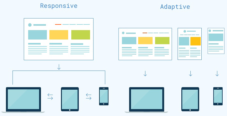
Responsive – “Responsive design is client-side, meaning the whole page is delivered to the device browser (the client), and the browser then changes how the page appears in relation to the dimensions of the browser window.” ~ Garrett Goodman of The Huffington Post
The positives of RWD are often stated in that the sites are easy to maintain, and they provide a consistent experience across devices. On the other hand, one channel typically suffers. If mobile first, for example, then the desktop does not look quite right. If desktop first, then mobile is overloaded. Still, there is unified content and code, which minimizes the resource burden of catering to both desktop and mobile users.
Adaptive – The positives of AWD are often under-stated in that it delivers a device-specific experience and it improves website performance (think speed, load times). AWD is not without its negatives though in that enterprises must manage separate code branches, which can add time to development and site updates – even though it uses a single content repository – still very much better than dedicated mobile sites. The content and code are both unified. Now, the mobile experience for both the end-user and the organization hosting the site itself, is becoming more mature.
Progressive – Progressive web aps are user experiences that have the reach of the web, and the web reaches three times as many people as native apps. Like each of the design approaches mentioned here, PWAs do have their downfalls in that organizations need to manage separate code branches. Managing separate code branches can add time to development and site updates, but PWAs use a single content repository so it is still faster than updating mobile themes.
While responsive web design is the de-facto mobile design approach these days, the negatives far outweigh the positives. Responsive sites send the entire website to a mobile device, which does nothing for user experience. This is called client-side (browser-side) rendering where a mobile browser is doing all the work. Adaptive Design is server-side rendering where the website decides which page elements to send to each browser and at what levels of quality.
For consumers, one size also does not fit all. Desktop does not fit mobile, mobile does not fit desktop. And desktop first does not prioritize mobile navigation or features. Mobile first doesn’t create a great browse experience on desktop either.
Why Adaptive and Progressive makes sense now – Technology is improving all the time and underlying technology is getting better and better to support adaptive and progressive approaches. Adaptive has not been discussed as much as responsive because the front-end code technologies were not as good, mobile was not as important as it is now, and responsive was so much better than desktop rendering that it was seen as a natural evolution. AWD has, however, so many positives from front-end development approaches that make it easier to maintain, front-end development approaches that make it faster, a single URL structure for search engine optimization (SEO) purposes (which is why many organizations started using RWD in the first place) and platforms that provide a mobile view for editors that can be integrated to an adaptive mobile strategy.
https://www.cleveroad.com/blog/responsive-web-design-vs-adaptive-web-design-how-to-make-your-choice